NINTENDO SWITCH
A high-fidelity UX case study mapping out a next-generation ecosystem for the Nintendo Switch. This redesign introduces intuitive navigation pillars, streamlined asset discovery, a centralized player profile, and a responsive Light/Dark environment built to modern console standards.
PROJECT TYPE
UX Case Study
TIMELINE
June 2026
ROLE
UX Research · UX Design · UI Design
TOOLS
Figma · FigJam · Photoshop
STATUS
Independent Case Study
Reimagining how players move through the console experience.
This project explores a next-generation operating system concept for the Nintendo Switch 2, focusing on how the interface could feel more intuitive and responsive to modern player needs.
The aim was to simplify the system’s information structure, improve how games are organised and create clearer pathways for discovering new content.
It also considers how a unified design system could scale smoothly across various experiences, while keeping the interface familiar and easy to navigate.
Figma UI/UX
System menus should support your momentum, not pause it.
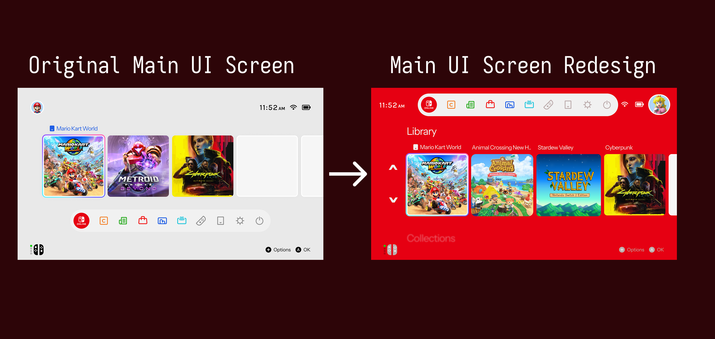
The original Nintendo Switch user interface is highly praised for its speed and minimalist utility, but its layout leaves opportunities on the table when it comes to deep game organization, player stats and community features. As digital libraries expand, the software needs to scale gracefully without losing its responsive edge. In comparison to competitor consoles, it differs in excess content, which is why it works and also why it doesn't.
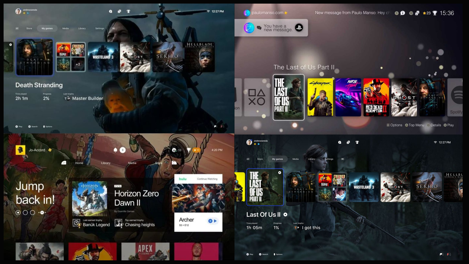
I started this independent case study to explore how the console's interface could evolve for the next generation. Rather than replacing Nintendo's signature brand charm, the goal was to streamline user flows across several core view states including a brand-new Library grid, custom user Collections, a predictive eShop discovery layout and an analytical profile dashboard. Below you can see my moodboard with collected images for inspiration for the Nintendo Switch 2's redesign.
Original UI
Inspiration Board
My Approach: building on Nintendo's identity while creating a cleaner experience.
My approach was focused on keeping the simplicity and familiarity of the Nintendo Switch interface, while exploring how it could be improved for a more modern console experience. I focused on creating clearer layouts, stronger visual hierarchy, and reusable UI patterns that would make navigation feel more organised and intuitive.
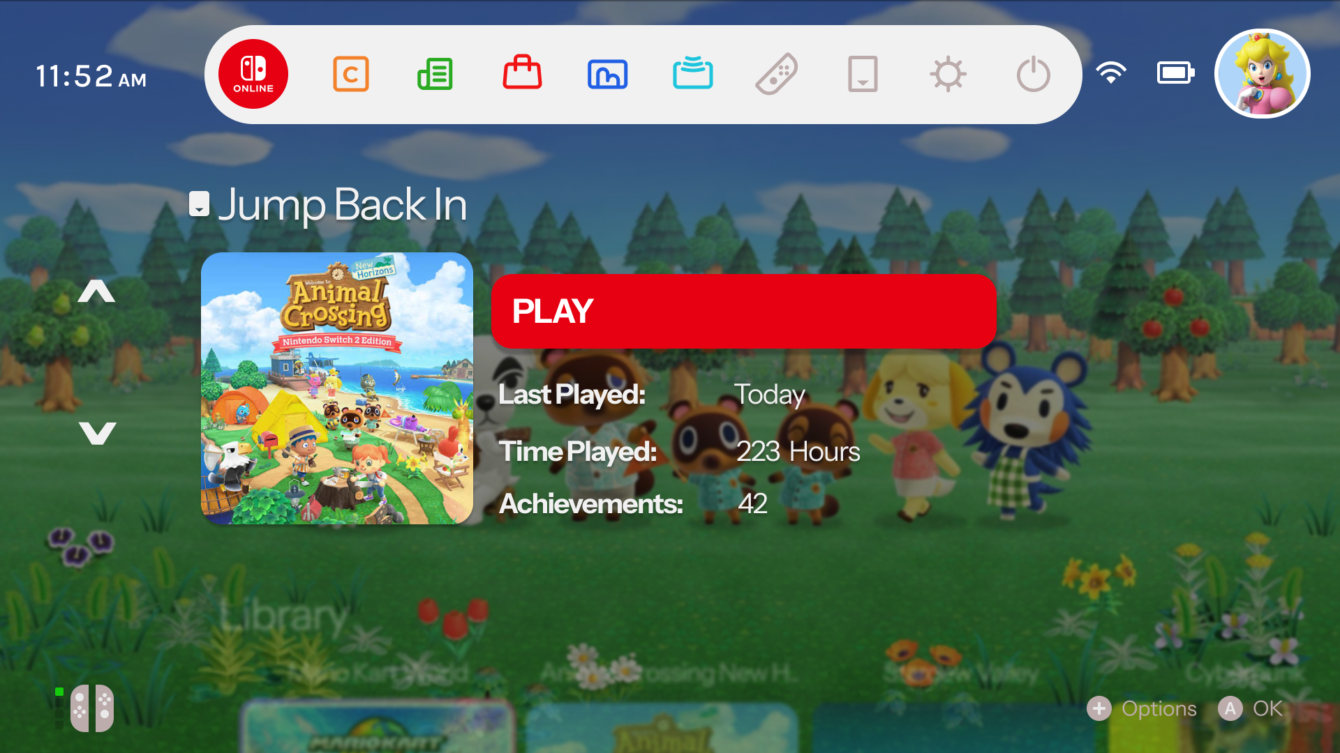
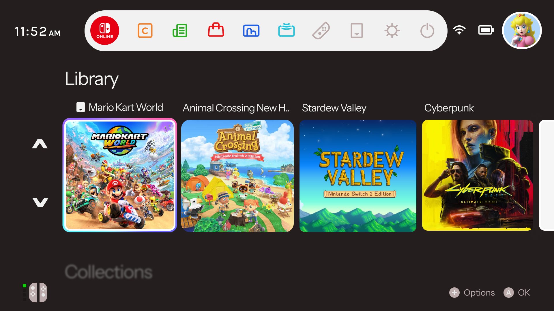
The visual direction was built around Nintendo's existing identity, using familiar colours and playful elements while introducing a more structured interface system. The design explored how light and dark environments could work consistently, with strong contrast and clear visual feedback for users.
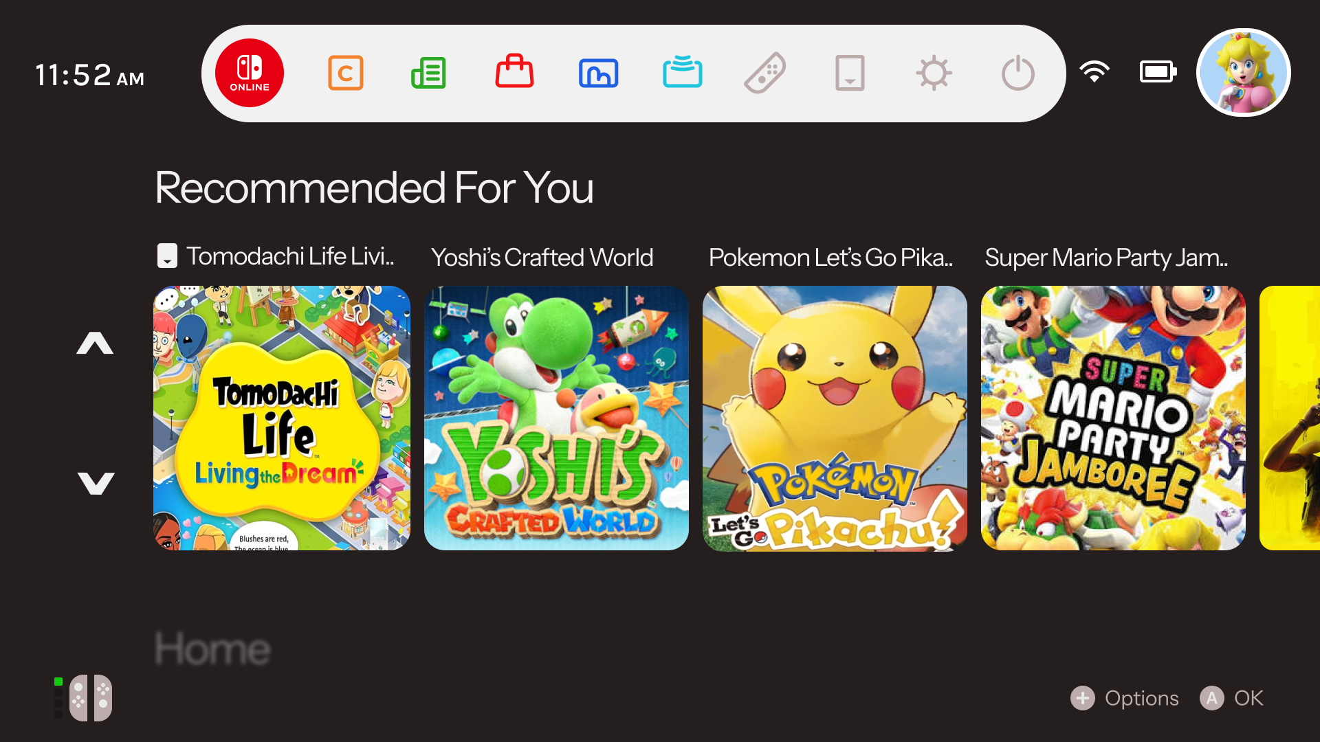
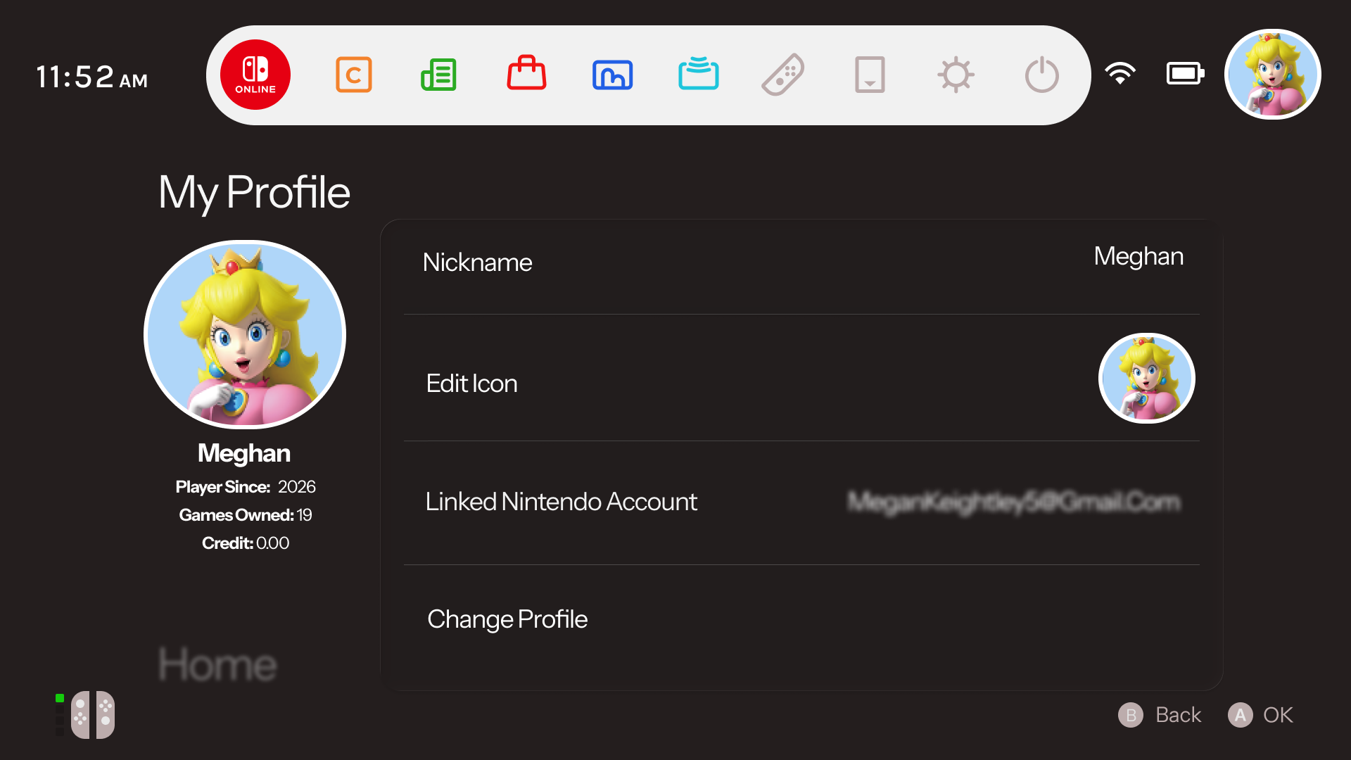
- Light & Dark Modes: Designed two interface themes that maintain the same visual language while adapting to different user preferences and environments.
- Improved Navigation: Refined key areas of the interface to make features like profiles, settings, notifications, and system information easier to discover.
- Controller-focused Layouts: Considered spacing, sizing, and focus states to create an interface that feels natural when navigating with a physical controller.
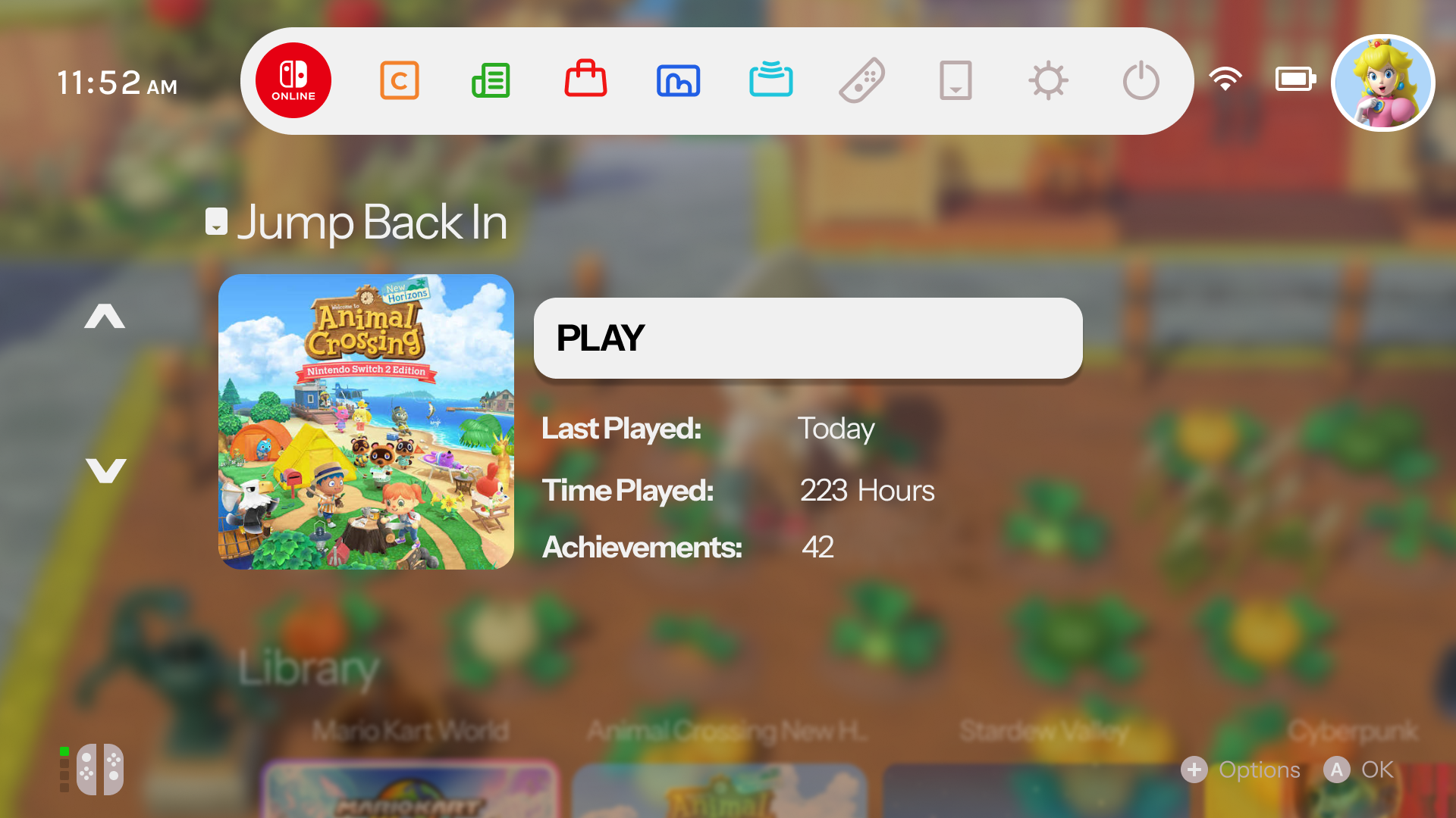
Seamless Resume
The main home dashboard focuses heavily on active momentum. The "Jump Back In" card features a suspended game state overlaying the background image, giving players instant access with clear, glanceable contextual details like total runtime, achievement completion, and a primary launch action button. This is something nintendo switch's UI currently lacks, with other consoles integrating this, I felt it's a strong design choice and provides a more personalised experience for the user.
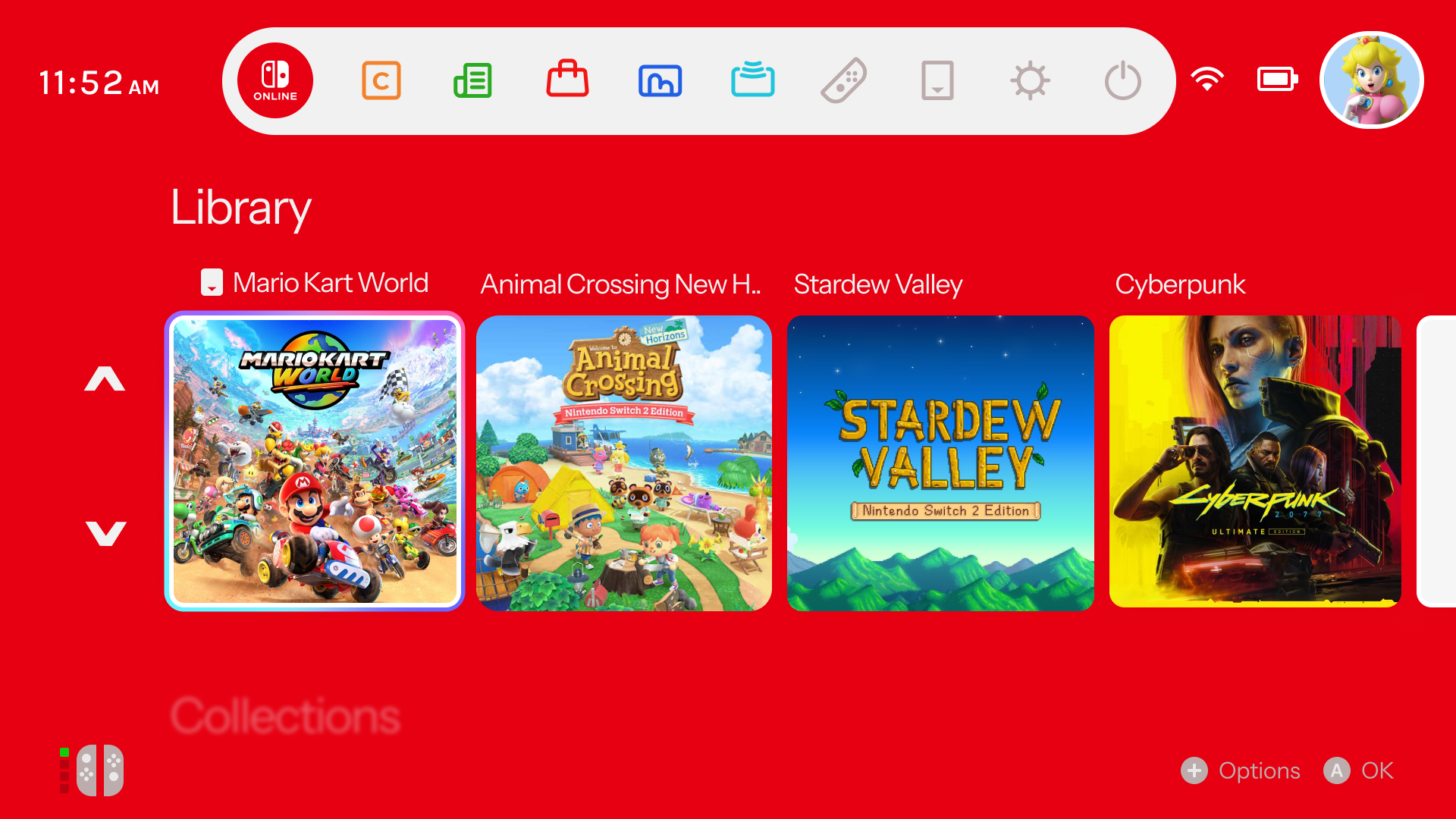
Game Library
Moving past simple item lists, the redesigned Library spaces assets across broad horizontal tracks. Bright card tokens with precise focus indicator borders allow smooth asset handling using the console d-pad, packing critical title information elegantly onto a high-contrast foundation.
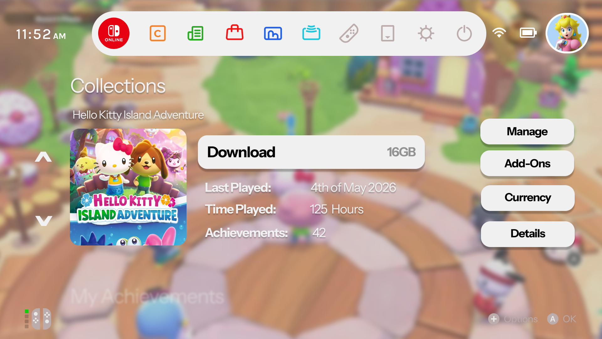
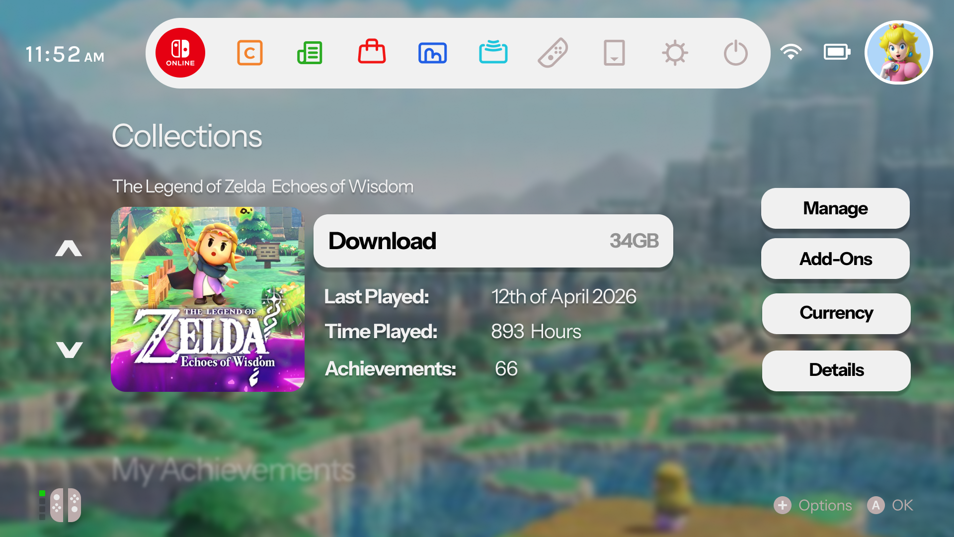
Personalised Collections
To manage large numbers of downloaded games, the Collections dashboard lets users organize software into customized folders. These groups look like elegant galleries, keeping title arrangements organized and making it fast to pick your next game.
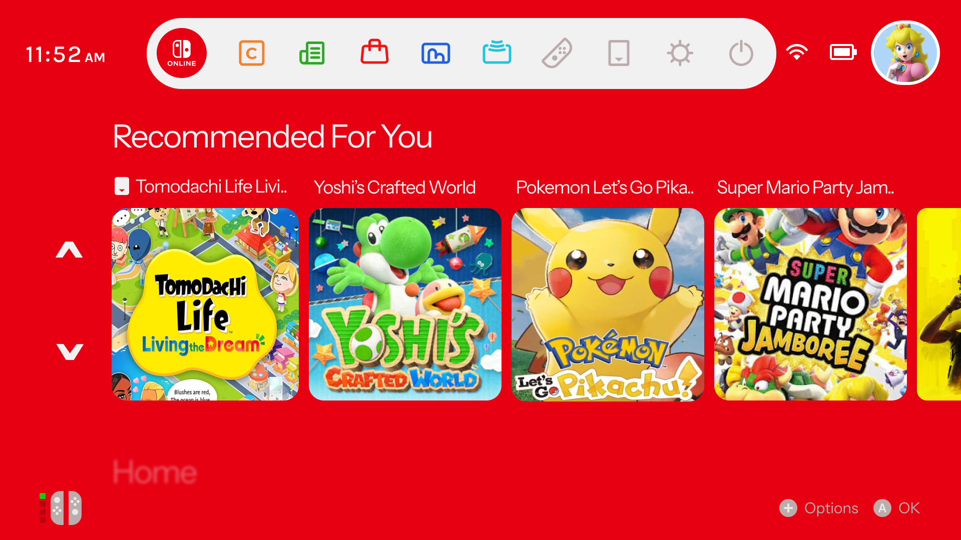
Discovery & Recommendations
The discovery engine integrates personalized, algorthmically driven recommendations straight onto the main board. This layout mimics clean showcase hubs, updating active cards automatically to highlight upcoming eShop launches, trending community activities and curated title suggestions.
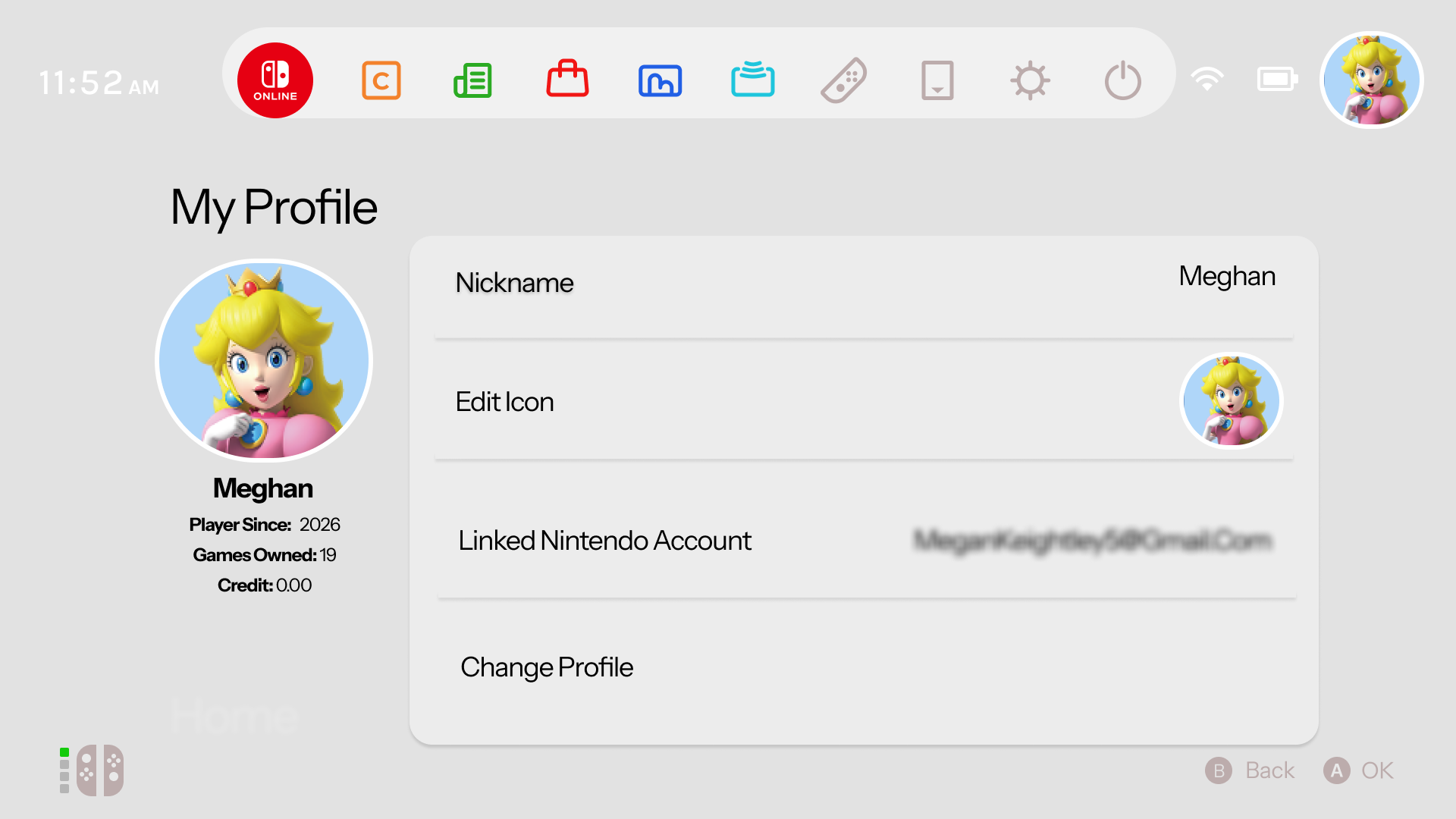
Centralized Profile Management
The My Profile space coordinates player data into a sleek control panel. This cleaner dashboard organizes user statistics, account credentials, avatar customizers and financial wallet logs onto a balanced layout that looks modern and matches the console's overall aesthetic.
Turning a concept into a more personable console experience.
I developed the redesign through Figma by creating reusable components, interface states and interactive prototypes to explore how the experience could flow across different areas of the console. Rather than completely changing Nintendo's existing identity, my aim was to build on what already works while introducing clearer navigation, improved organisatio and offer an even more personalised user experience.
Overall, the outcome I aimed for was a cleaner and more connected interface that feels familiar to existing Switch users and competitor console UI while addressing areas where the current system could be expanded. This project helped me explore how small UX decisions, such as information layout, hierarchy and accessibility of features can have a large impact on how users interact with a digital product.